

Brands we helped bring to life.
Three houses, three worlds. Hover a name to step into its colours, then choose one to see how we helped it rebrand and grow.
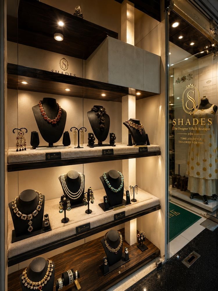
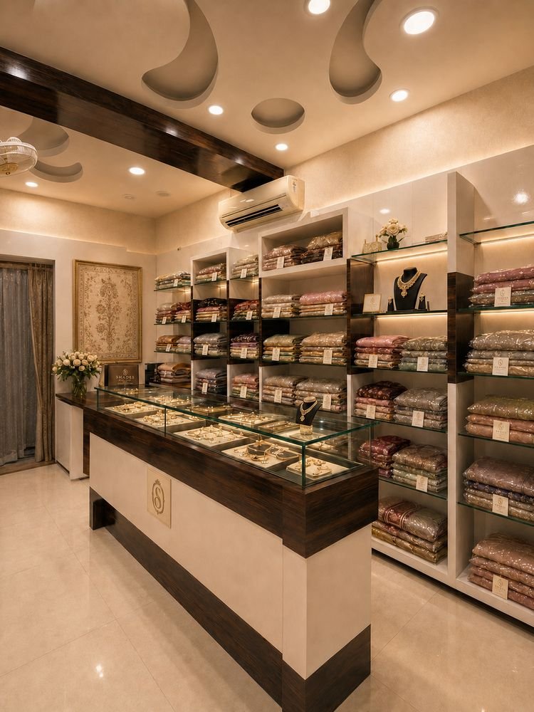
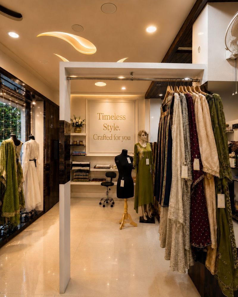
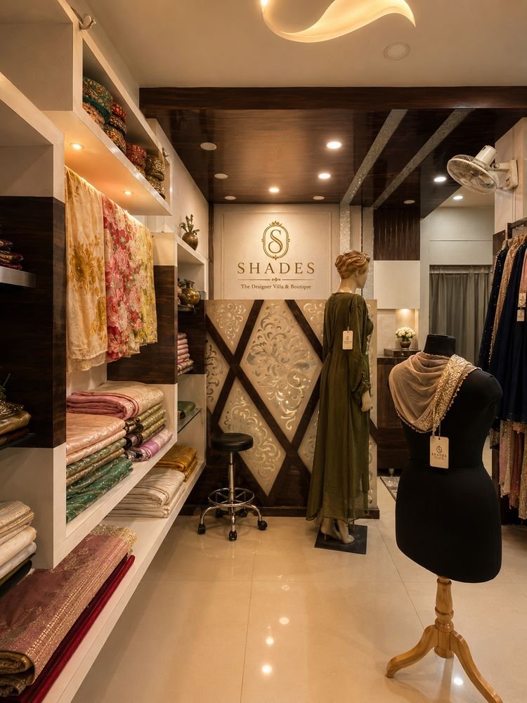
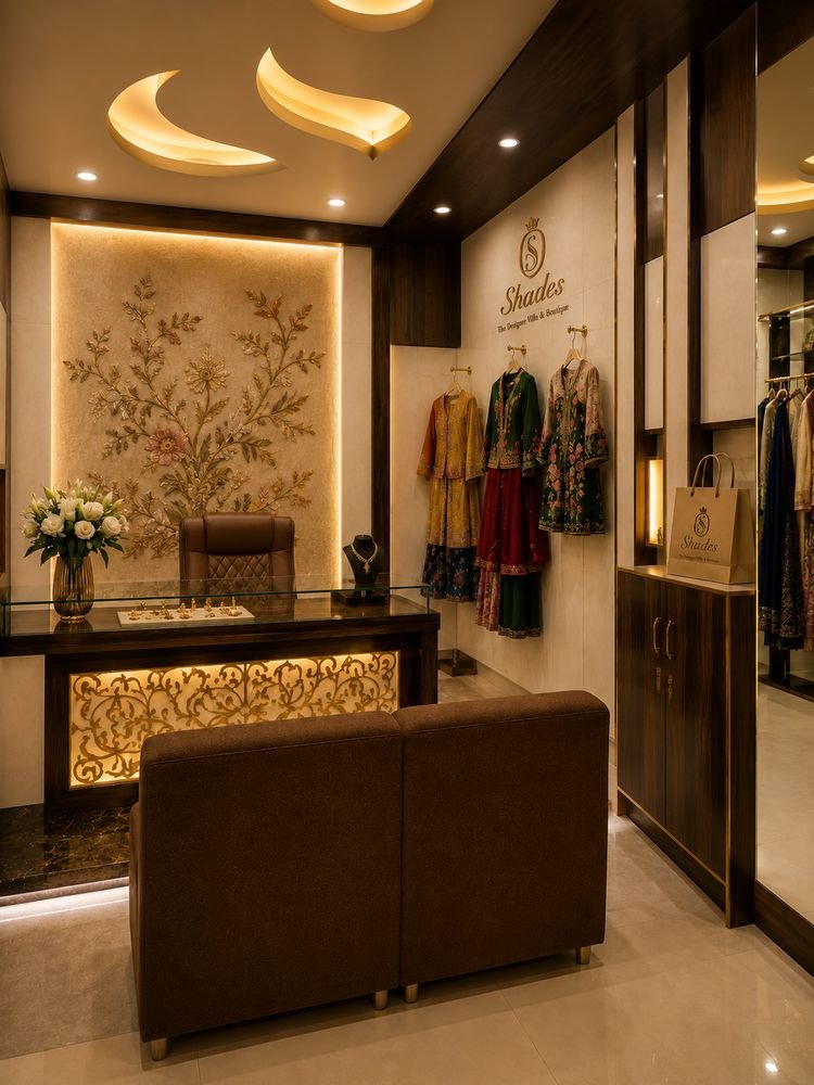
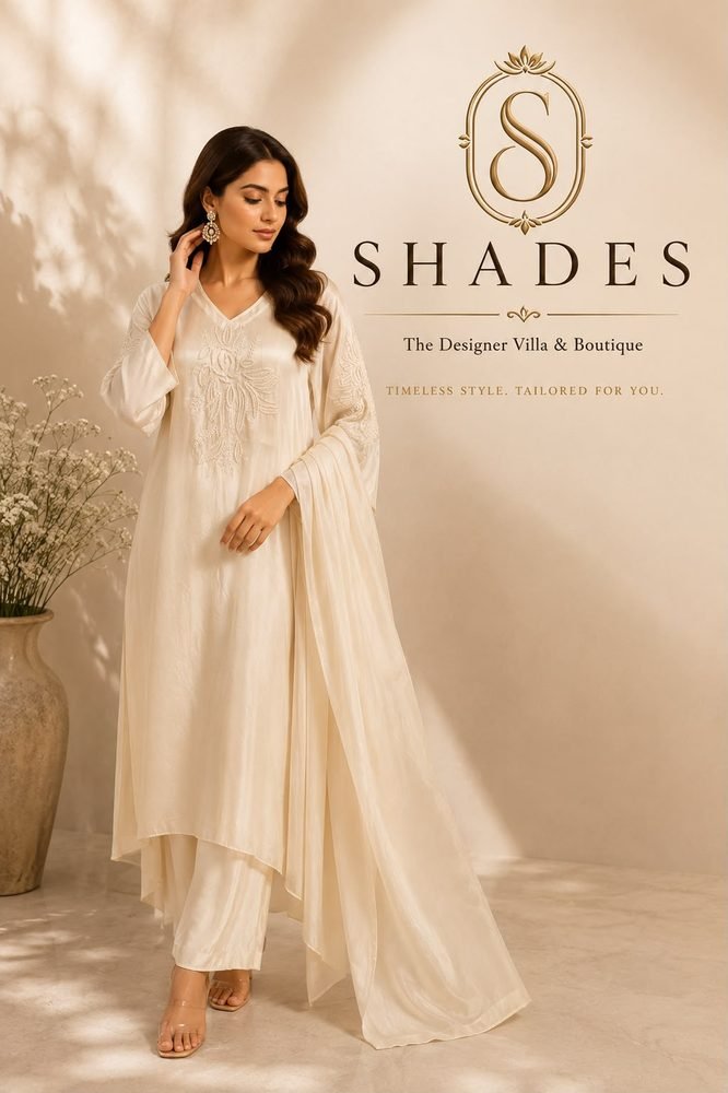
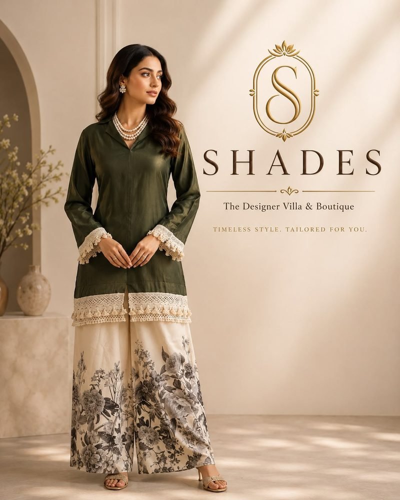
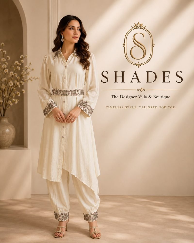
The Designer Villa & Boutique. A luxury couture house for women, from dream design to custom couture. Timeless style. Tailored for you.
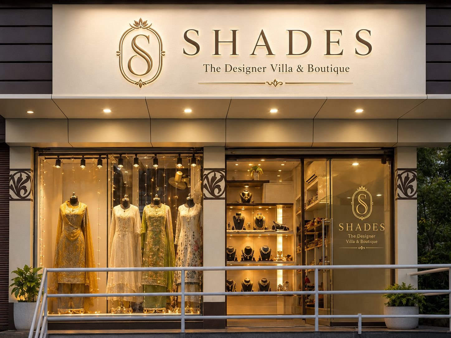
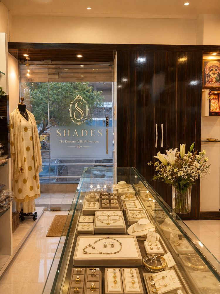
A boutique with the calm of a villa.
Positioning
Placed as a couture destination for women who want pieces made for them, not bought off a rail.
Her wardrobe
Collections framed around the client's moments: everyday elegance, celebration and bridal.
Identity system
Warm neutrals and soft gold, with refined serif type that reads like a label sewn by hand.
Brand voice
Quiet confidence. Personal, unhurried and always about how she feels in the piece.
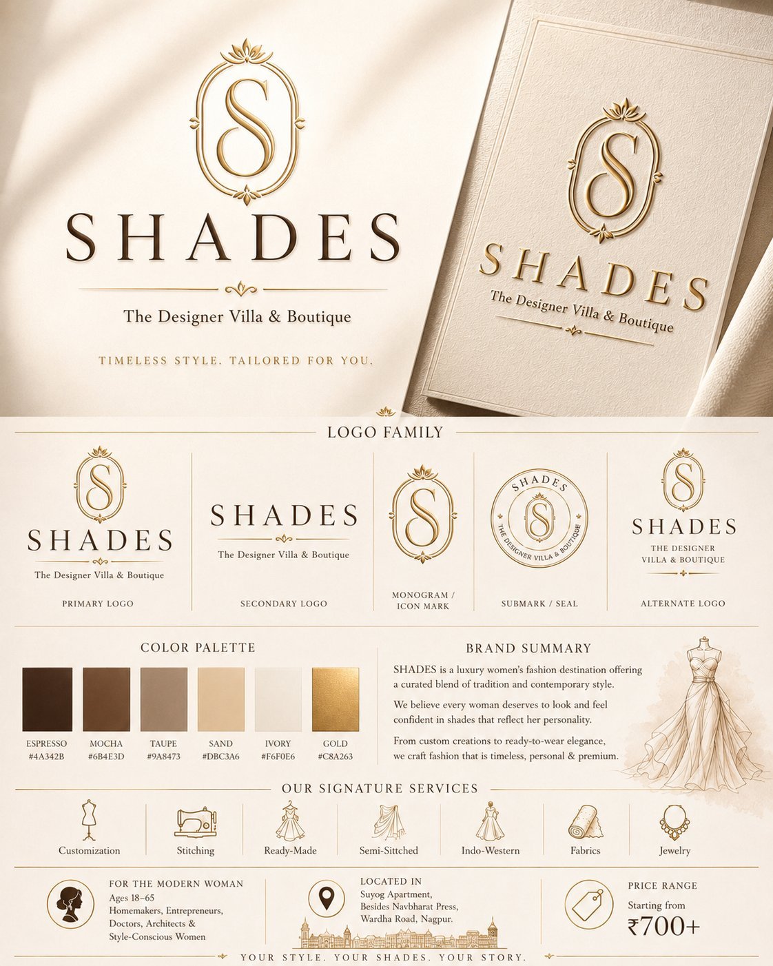
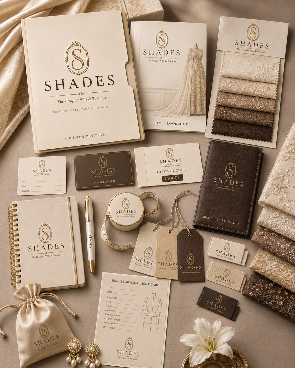
How we helped Shades grow.
From boutique to couture house
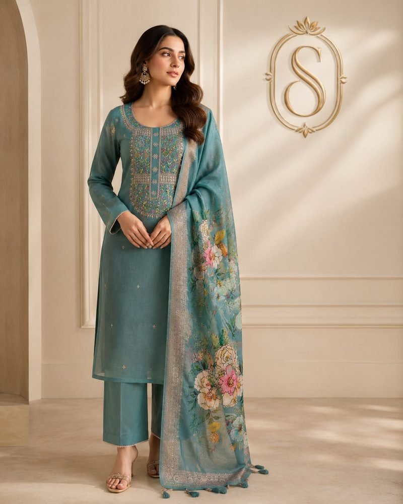
A logo family built on an S monogram in an oval frame, a warm palette and one promise: timeless style, tailored for you.
- Logo family
- Palette
- Tagline
A store that feels tailored
Storefront signage, window displays and in-store visual merchandising, so the brand reads the same from the street to the counter.
- Signage
- Displays
- Visual merchandising
Room for every collection
Tags, labels, a lookbook, loyalty cards, gift vouchers and measurement cards, with campaign shoots that carry each collection.
- Stationery
- Packaging
- Campaigns

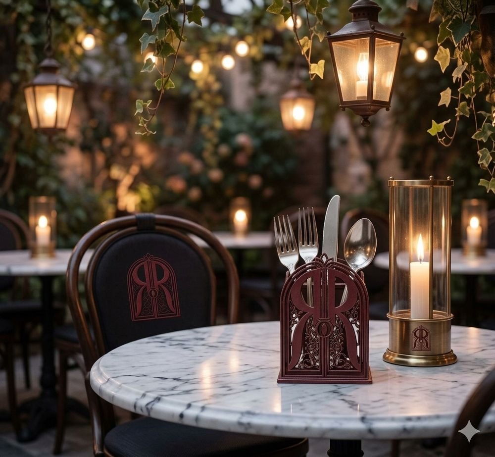
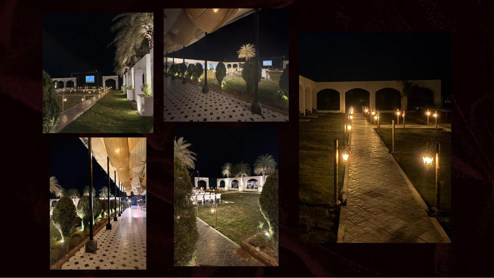
A garden lounge and fine-dining restaurant with two souls: Garden of Sattva and Garden of Zaika. A place where flavour, culture and aura come together.
We didn't just make it beautiful. We made it mean something.
Strategy
Defined the essence and ambience first, so every later choice had a reason to exist.
Business
Two garden concepts under one name, giving the restaurant room for different moods and menus.
Aesthetic
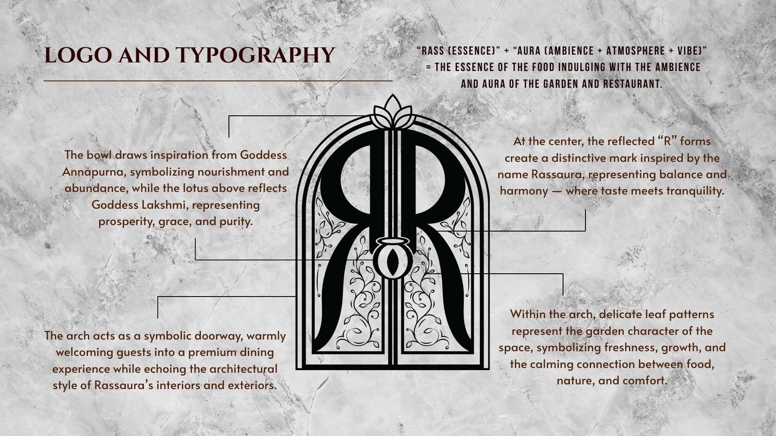
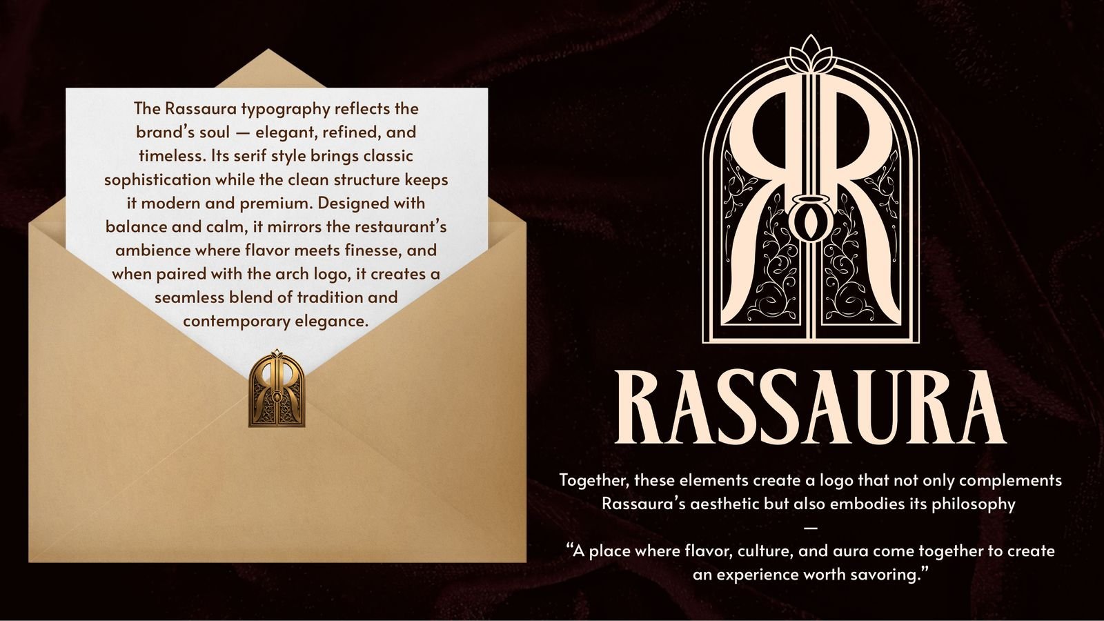
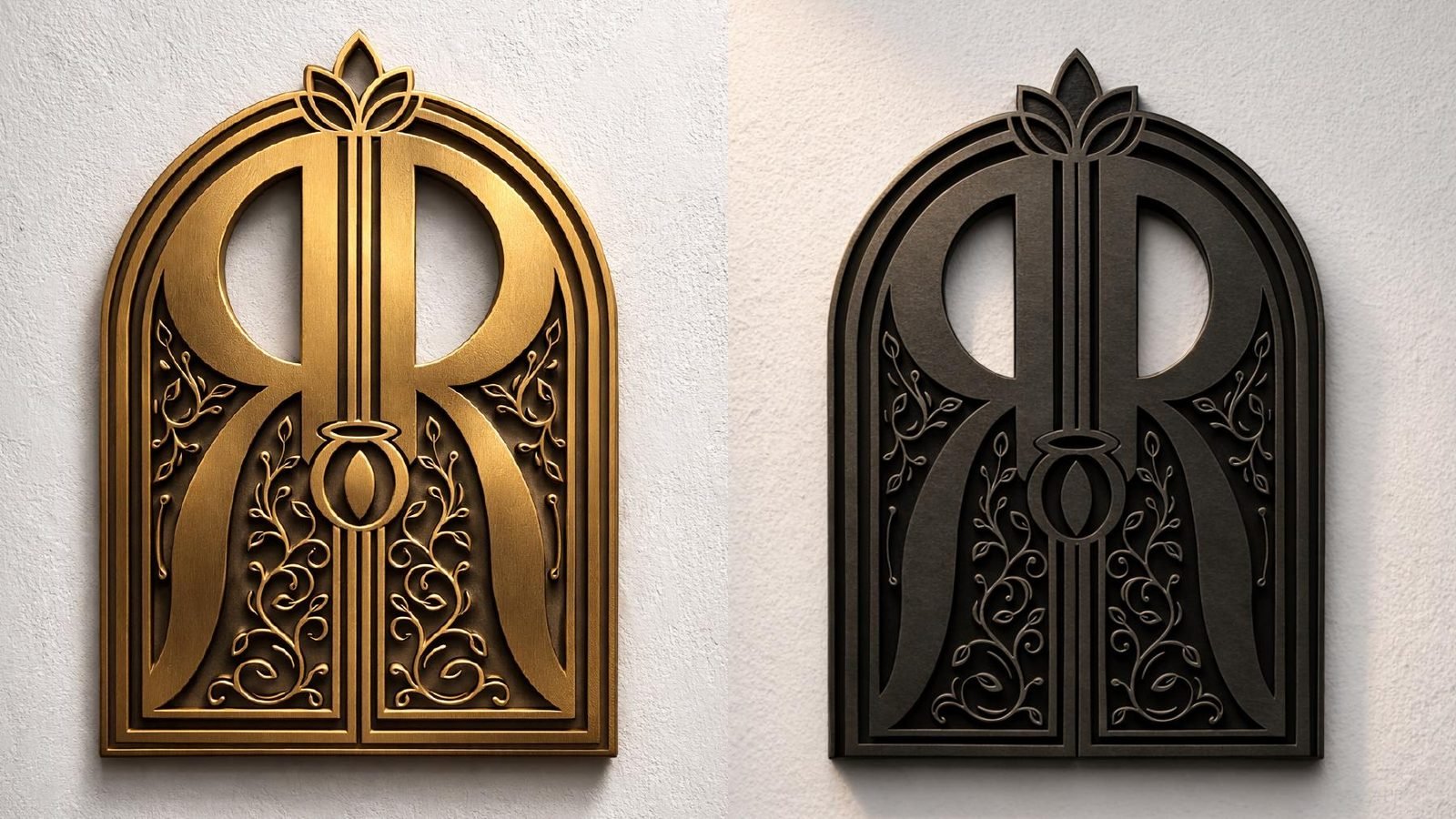
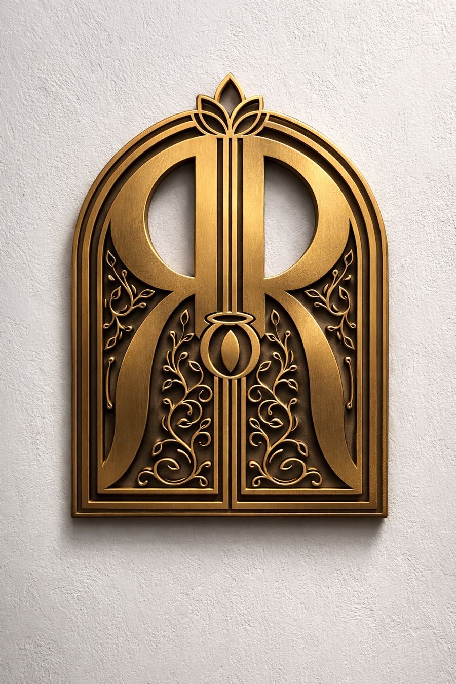
An arch monogram of twin Rs framed like a garden gateway, with typography that is elegant and calm.
Tone
Warm, gracious and unhurried. Hospitality that feels like being invited into someone's home.
How we helped Rassaura grow.
An identity with roots
Built on the name itself: Rass, the essence of the food, and Aura, the ambience of the garden. The arch monogram carries Annapurna's bowl, Lakshmi's lotus and the garden's leaves.
- Brand meaning
- Monogram
- Typography
Every touchpoint dressed
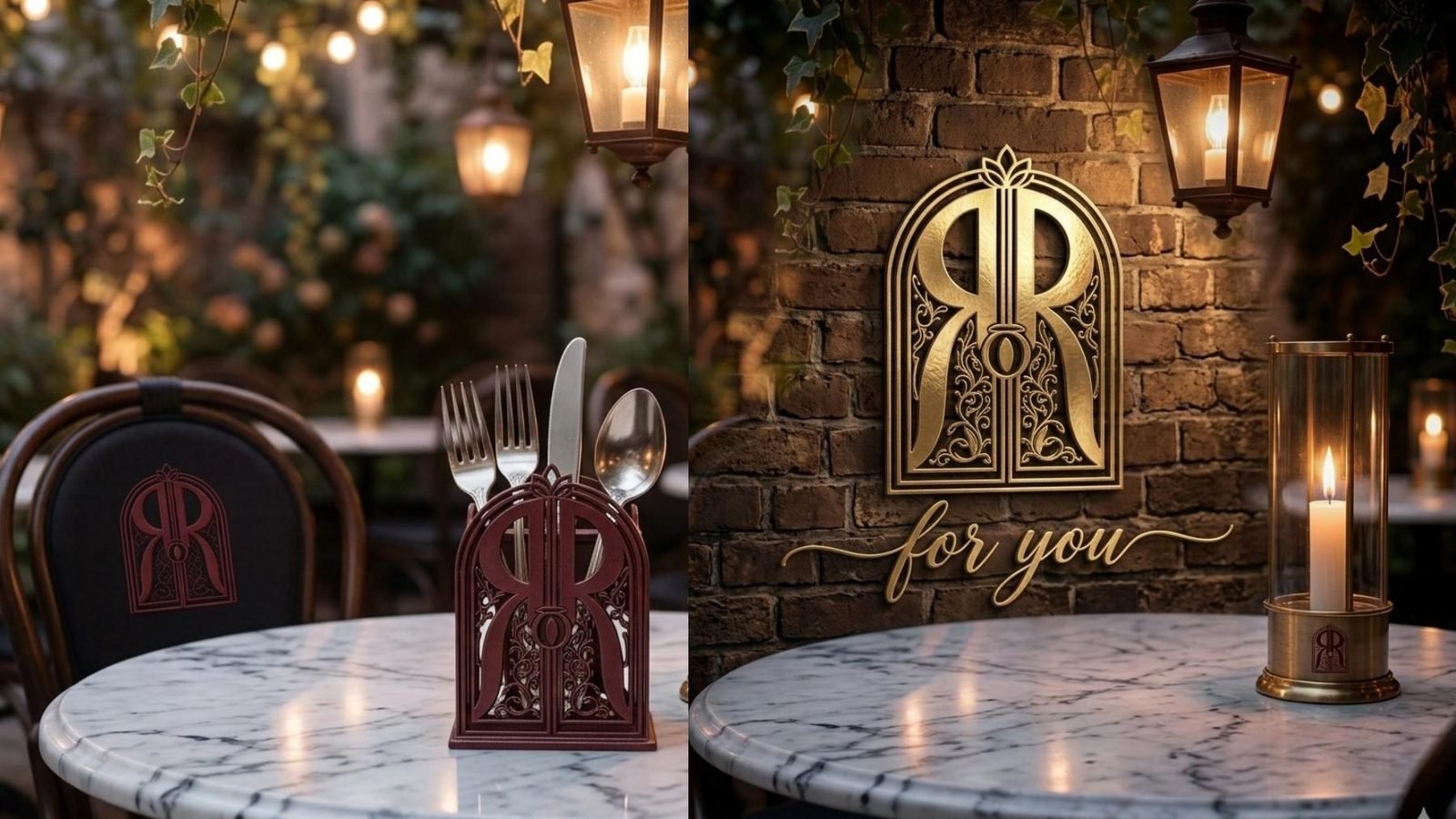
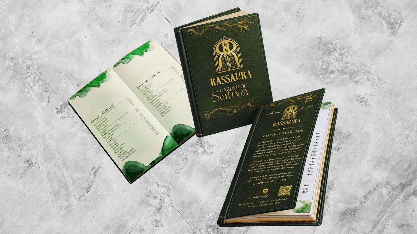
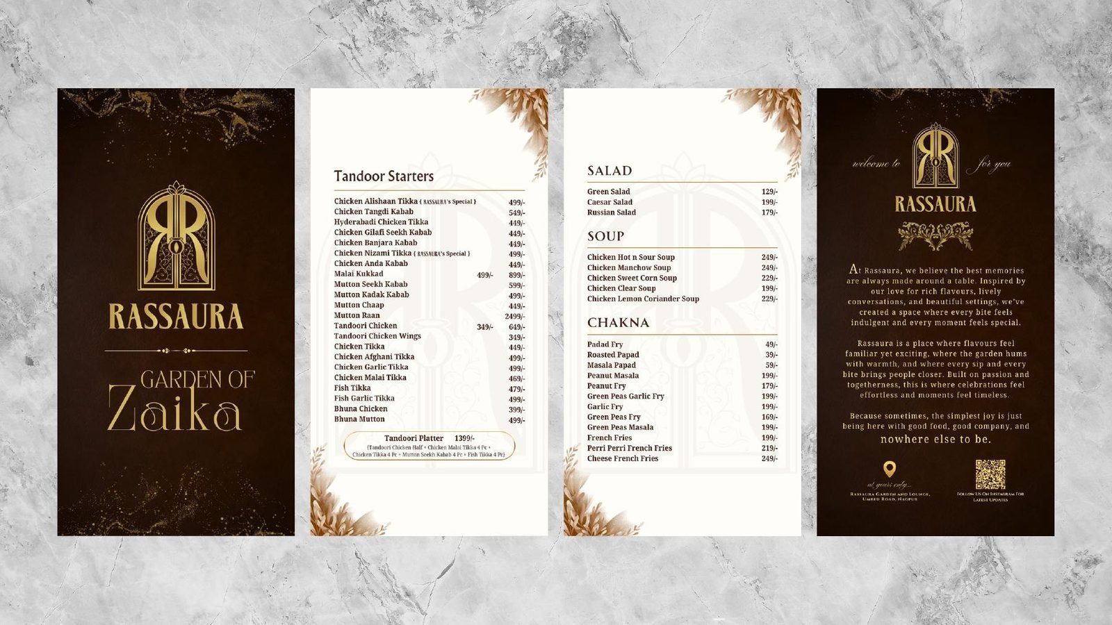
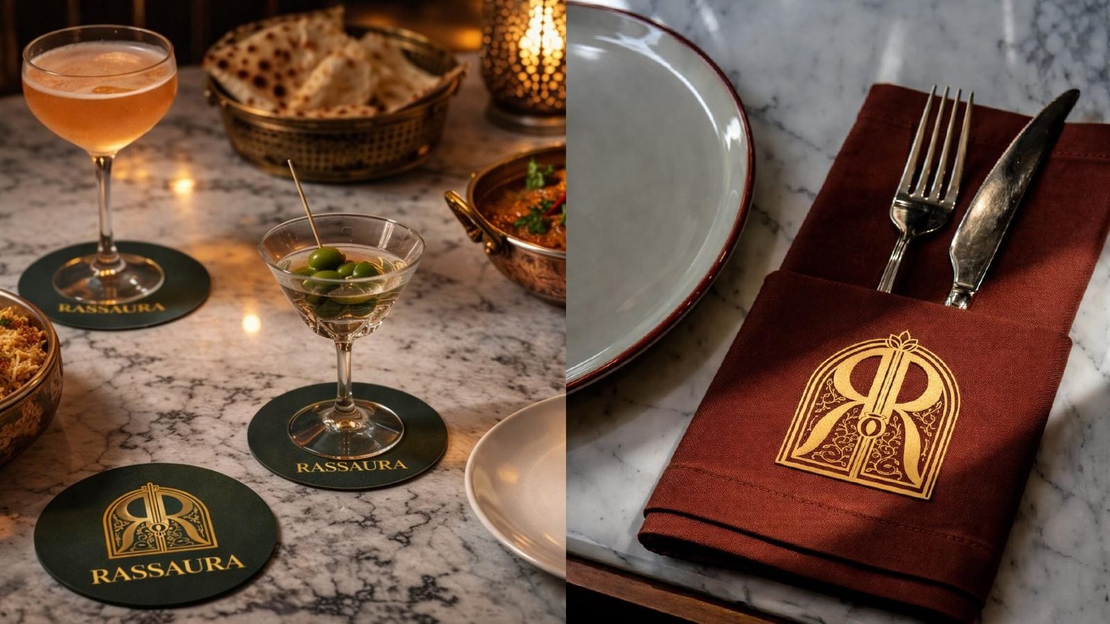
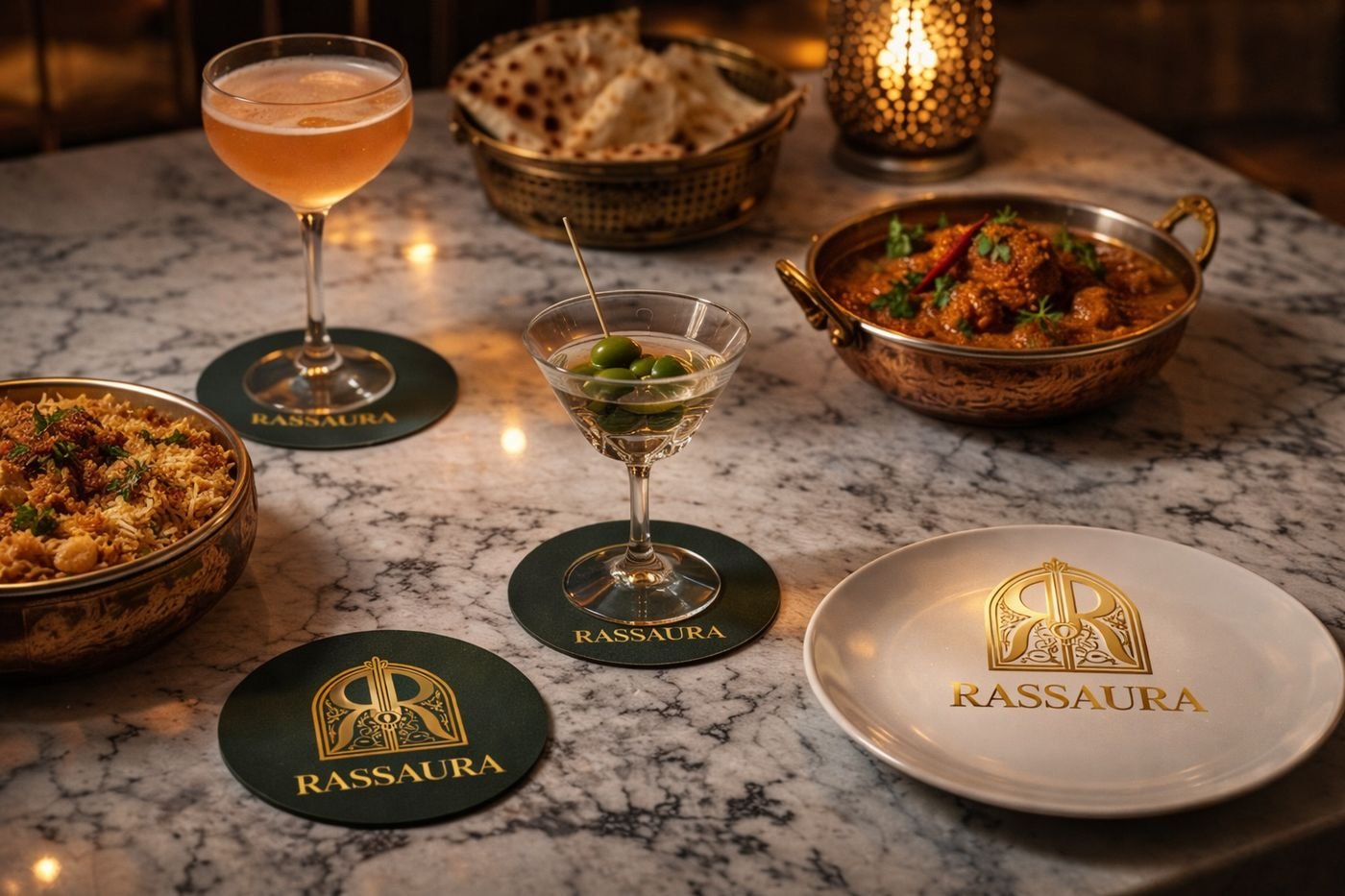
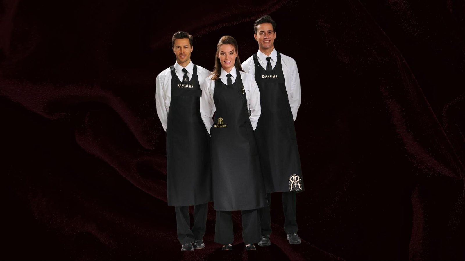
Menus for both gardens, coasters, napkins, cutlery holders, wall plaques, signage and staff uniforms, all speaking one language.
- Menus
- Tableware
- Signage
- Uniforms
One system, room to grow
Two dining concepts and a full garden venue under one identity, so new menus, events and spaces roll out without starting over.
- Sub-brands
- Venue experience
- Brand guidelines
Omkar Ayurveda & Wellness Centre
A clinic in Pune bringing Ayurveda, Panchakarma therapy, Garbha Sanskar and yoga together with special education and remedial therapy for children. We rebranded it and built the materials that carry it into the community.
The meaning behind the mark.
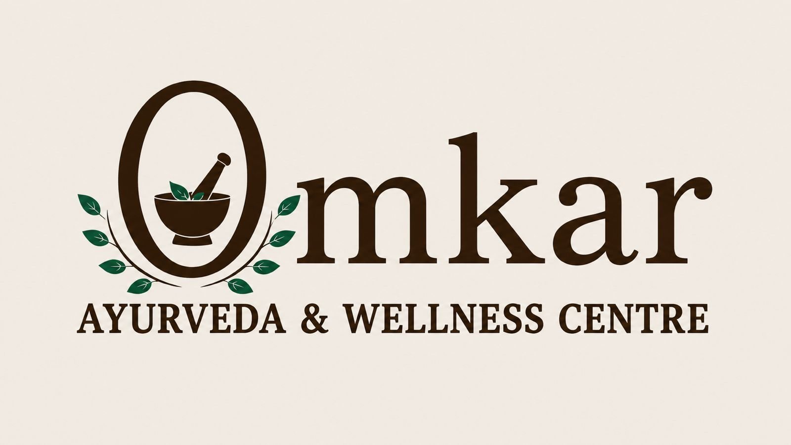
- 1The 8 leavesSymbolically represent balance, stability, prosperity and long-term growth in numerology.
- 2The oval “O”Conveys wholeness, continuity and holistic wellness.
- 3The khal-battaInstantly communicates traditional Ayurvedic preparation and natural healing.
- 4Brown and greenCreate associations with earth, herbs, trust and wellbeing, while the symmetrical design improves visibility and brand recall.
Numerology is a symbolic belief system; the visibility and colour benefits come from established design principles.
How we helped Omkar grow.
A mark that explains itself
A new logo built from Ayurveda's own symbols, in earthy brown and herbal green, so patients understand the clinic at a glance.
- Logo
- Colour
- Meaning
A clinic that speaks clearly
A letterhead for every prescription and a 3 × 4 ft poster that lists treatments plainly, led by Panchakarma therapy.
- Letterhead
- Clinic poster
Reaching families too
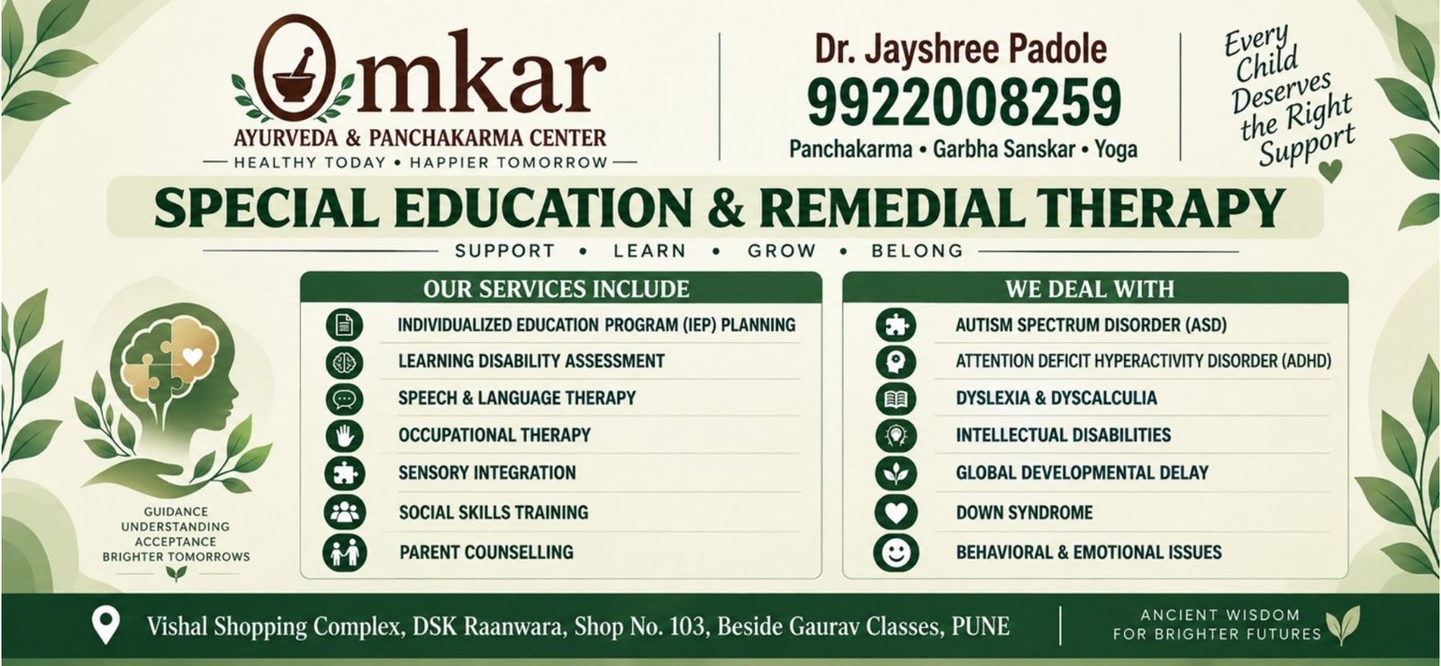
A 6.5 × 3 ft flex that gives the special education and remedial therapy service its own voice, so the clinic reaches parents as well as patients.
- Service flex
- Outreach


And we will help build your world the same way.
Start your dream with us →and we'll help you give it purpose.